Skip to content

feat(badge): add href and icon props - #734

Merged
mattrothenberg merged 4 commits into
cloudflare:mainfrom
nandanmen:nanda/add-href-to-badge
Aug 18, 2026
Merged

feat(badge): add href and icon props#734
mattrothenberg merged 4 commits into
cloudflare:mainfrom
nandanmen:nanda/add-href-to-badge

Conversation

@nandanmen

@nandanmen nandanmen commented Aug 17, 2026

Copy link
Copy Markdown
Contributor

This PR adds the icon and href props to the Badge component:

CleanShot 2026-08-17 at 11 34 48@2x

This allows us to finally migrate the badges in the worker cards away from the bespoke implementation:

CleanShot 2026-08-17 at 11 38 57@2x
  • Reviews
    • bonk has reviewed the change
    • automated review not possible because:
  • Tests
    • Tests included/updated
    • Automated tests not possible - manual testing has been completed as follows:
    • Additional testing not necessary because:

@mattrothenberg

Copy link
Copy Markdown
Collaborator

/bonk review

@pkg-pr-new

pkg-pr-new Bot commented Aug 17, 2026

Copy link
Copy Markdown
npm i https://pkg.pr.new/@cloudflare/kumo@734

commit: 7a25ff0

@github-actions

github-actions Bot commented Aug 17, 2026

Copy link
Copy Markdown
Contributor

Docs Preview

View docs preview

Commit: 7a25ff0

@github-actions

github-actions Bot commented Aug 17, 2026

Copy link
Copy Markdown
Contributor
Visual Regression Report — 29 changed, 14 unchanged

29 screenshot(s) with visual changes:

Button / Variant: Primary

1,095 px (1.24%) changed

Before After Diff
Before After Diff

Button / Variant: Destructive

1,767 px (2%) changed

Before After Diff
Before After Diff

Button / Sizes

231 px (0.26%) changed

Before After Diff
Before After Diff

Button / Loading State

820 px (0.93%) changed

Before After Diff
Before After Diff

Button / Disabled State

234 px (0.26%) changed

Before After Diff
Before After Diff

Button / Title

823 px (0.93%) changed

Before After Diff
Before After Diff

Button / Link with Tooltip

724 px (0.82%) changed

Before After Diff
Before After Diff

Button / Disabled Link

743 px (0.84%) changed

Before After Diff
Before After Diff

Dialog / Dialog With Actions

298 px (0.34%) changed

Before After Diff
Before After Diff

Dialog / Dialog Sizes

2,891 px (3.26%) changed

Before After Diff
Before After Diff

Dialog / Dialog Alert

1,168 px (1.32%) changed

Before After Diff
Before After Diff

Dialog / Dialog Confirmation

1,735 px (1.96%) changed

Before After Diff
Before After Diff

Dialog / Custom Max Width

951 px (1.07%) changed

Before After Diff
Before After Diff

Dialog / Dialog With Select

383 px (0.43%) changed

Before After Diff
Before After Diff

Dialog / Dialog With Combobox

253 px (0.29%) changed

Before After Diff
Before After Diff

Dialog / Dialog With Dropdown

386 px (0.44%) changed

Before After Diff
Before After Diff

Dialog (Open)

0 px (0%) changed

Before After Diff
Before After Diff

Select / Select Basic

1,048 px (1.18%) changed

Before After Diff
Before After Diff

Select / Select Sizes

170 px (0.1%) changed

Before After Diff
Before After Diff

Select / Select With Error

1,979 px (1.9%) changed

Before After Diff
Before After Diff

Select / Select Placeholder

1,279 px (1.44%) changed

Before After Diff
Before After Diff

Select / Select With Tooltip

853 px (0.96%) changed

Before After Diff
Before After Diff

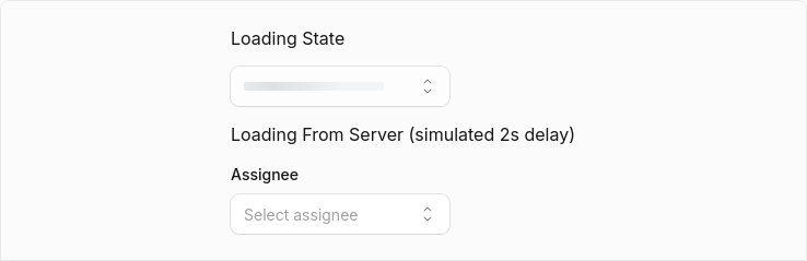
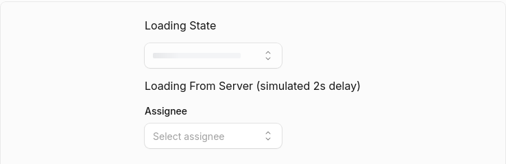
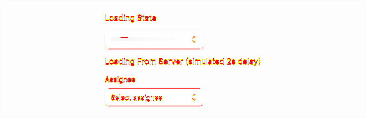
Select / Select Loading

3,191 px (1.81%) changed

Before After Diff
Before After Diff

Select / Select Disabled Options

1,217 px (1.37%) changed

Before After Diff
Before After Diff

Select / Select Disabled Items

732 px (0.83%) changed

Before After Diff
Before After Diff

Select / Select Grouped

968 px (1.09%) changed

Before After Diff
Before After Diff

Select / Select Grouped With Disabled

190 px (0.21%) changed

Before After Diff
Before After Diff

Select / Select Long List

1,967 px (1.89%) changed

Before After Diff
Before After Diff

Select (Open)

1,082 px (0%) changed

Before After Diff
Before After Diff
14 screenshot(s) unchanged
  • Button / Basic
  • Button / Variant: Secondary
  • Button / Variant: Ghost
  • Button / Variant: Outline
  • Button / Variant: Secondary Destructive
  • Button / With Icon
  • Button / Icon Only
  • Button / Link as Button
  • Dialog / Dialog Basic
  • Select / Select Without Label
  • Select / Select With Description
  • Select / Select Custom Rendering
  • Select / Select Multiple
  • Select / Select Complex

Generated by Kumo Visual Regression

@ask-bonk

ask-bonk Bot commented Aug 17, 2026

Copy link
Copy Markdown
Contributor

Thanks for the PR! The href and icon props are useful additions and the LinkProvider integration is consistent with the rest of the library.

I have a few concerns, mainly around the significant test removals that don't appear to be justified by the feature changes.

Blocking

1. Unjustified test removals

A large number of existing tests were removed without explanation:

  • "merges custom className" — verifies consumer overrides still work
  • "applies variant classes for filled badges" — verifies variant styling is applied
  • "applies dot appearance classes instead of variant classes" — verifies appearance overrides variant bg/text
  • "renders correct dot color per variant" — verifies dot color mapping for all supported variants
  • "returns base styles with no arguments" — verifies badgeVariants() default output
  • "includes variant classes for filled appearance" — verifies badgeVariants includes variant classes
  • "omits variant classes for dot appearance" — verifies badgeVariants omits variant classes for dot mode
  • "every variant entry has classes and description" changed to only check description

These tests verified behavior that still exists and would still pass with your changes. Removing them reduces coverage and makes the codebase more fragile. Please either restore them or explain in the PR description why each removal is necessary.

Suggestions

2. href prop is too restrictive

The href prop only accepts a string and the component passes only className and href to LinkComponent. This means consumers can't pass target="_blank", rel, onClick, or other anchor attributes. Compare with LinkButton which extends React.AnchorHTMLAttributes<HTMLAnchorElement> and spreads remaining props.

Consider whether Badge should also accept other anchor props when href is provided, or whether this was an intentional simplification.

3. Missing displayName

Badge is missing a displayName. Per the component conventions:

Missing displayName — Breaks React DevTools — Set after forwardRef

While Badge isn't currently using forwardRef, adding Badge.displayName = "Badge" would help with React DevTools and keep the file consistent with other components.

4. Untested visual combinations

  • icon + appearance="dot" — should add a test to verify both render together correctly.
  • icon with asymmetric padding (pl-1.5 vs pr-2 from px-2) — not tested or documented. Consider adding a test.
  • className merging with href or icon — the removed "merges custom className" test covered the base case; this should be restored.

5. gap-1 in base styles vs gap-1.5 in dot appearance

Adding gap-1 to KUMO_BADGE_BASE_STYLES means both gap-1 and gap-1.5 are present when appearance="dot". Since badgeVariants emits appearance classes after base styles, gap-1.5 wins via CSS cascade, but this is a small maintenance burden. Consider whether dot appearance should explicitly override gap.

6. Linked badge hover style

hover:ring hover:ring-current is a subtle hover effect for linked badges. Is this consistent with the design system? LinkButton uses a much richer hover state. If this is the intended design, no action needed — just confirming.

Positive notes

  • Changeset looks good — minor bump is appropriate for new props.
  • LinkProvider integration test is well-written.
  • Demo examples in the docs are helpful.

@ask-bonk

ask-bonk Bot commented Aug 17, 2026

Copy link
Copy Markdown
Contributor

Posted a review on PR #734.

Summary

Blocking concern: The PR removes ~8 existing tests without justification. Tests covering className merging, variant class application, dot appearance overrides, dot color mapping, and badgeVariants behavior were all deleted, even though they would still pass with the new changes. I asked the author to restore them or explain why each removal is necessary.

Other feedback given:

  1. href API design — Only accepts a string and doesn't pass other anchor props (target, rel, onClick) to LinkComponent. This is more restrictive than LinkButton.
  2. Missing displayName — Badge lacks Badge.displayName = "Badge" for React DevTools consistency.
  3. Untested combinationsicon + dot appearance, className with href/icon, and the asymmetric pl-1.5` padding adjustment.
  4. gap-1 vs gap-1.5 — Base styles now include gap-1, which coexists with gap-1.5 from dot appearance.
  5. Linked badge hover style — The hover:ring hover:ring-current effect is subtle compared to LinkButton; confirmed if this is by design.

Positive notes: Changeset is appropriate, LinkProvider integration test is well-written, and the docs demos are helpful.

github run

@mattrothenberg

Copy link
Copy Markdown
Collaborator

/bonk re-review and approve please

@ask-bonk ask-bonk Bot left a comment

Copy link
Copy Markdown
Contributor

Choose a reason for hiding this comment

The reason will be displayed to describe this comment to others. Learn more.

Previous concerns have been addressed. The href prop was removed from Badge in favor of wrapping with Link, which is a cleaner API that avoids prop-creep and is consistent with the rest of the library. All existing badge tests remain intact, and the new icon prop is well-covered with unit tests and type tests. The discriminated union for FilledBadgeProps | DotBadgeProps correctly prevents passing icon to dot badges. Docs demos and visual test fixtures are a nice addition.

@ask-bonk

ask-bonk Bot commented Aug 18, 2026

Copy link
Copy Markdown
Contributor

Approved PR #734.

The previous blocking concern about test removals is resolved—all existing tests remain intact. The decision to drop the href prop from Badge and instead rely on wrapping with Link makes the API simpler and avoids the prop-creep issues I flagged earlier. The discriminated union types and @ts-expect-error tests properly prevent invalid icon + dot combinations. LGTM.

github run

@mattrothenberg
mattrothenberg merged commit aa6edff into cloudflare:main Aug 18, 2026
15 of 17 checks passed
Sign up for free to join this conversation on GitHub. Already have an account? Sign in to comment

Labels

None yet

Projects

None yet

Development

Successfully merging this pull request may close these issues.

2 participants