

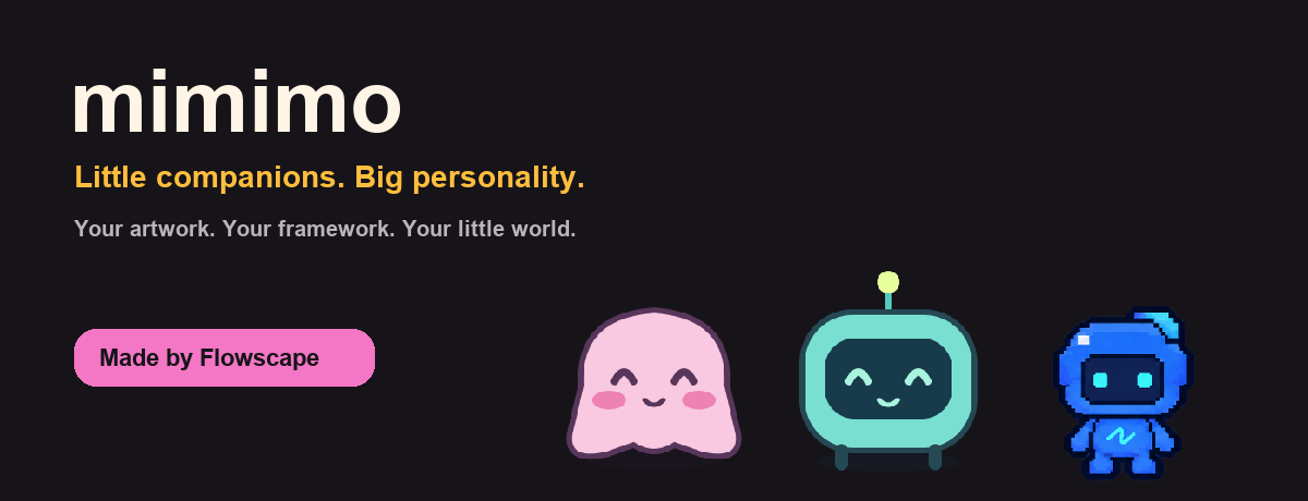
npm install @flowscape-ui/mimimo @flowscape-ui/mimimo-pet-mochiThe core contains no artwork. Install one of the independent Mochi, Byte or Flowy packs, or supply your own assets. ESM and TypeScript declarations are included.

Tiny website companions by Flowscape. TypeScript, no runtime framework or bundled pets.
import { createPet } from '@flowscape-ui/mimimo';
import { mochi } from '@flowscape-ui/mimimo-pet-mochi';

// Call after your component mounts.
const pet = createPet({ character: mochi, draggable: true });
pet.addReaction('click', 'happy');
pet.say('Hello!');

// On unmount:
// pet.destroy();
States support still images, frame sequences, uniform-grid sprite sheets, muted video and native GIFs. Frames/sprites use fps and speed; video uses speed. Native GIF timing is controlled by the file, not the library.
Ready-made packs remain supported via createPet({ character }). See the interactive documentation source for complete Vanilla, React and Vue examples. Run the docs app to try the live demos.
say(string) remains supported. Use a structured message for a bold title and a muted description:
const pet = createPet({
  character: mochi,
  bubble: { enabled: true, closeButton: false },
});
pet.say({ title: 'Preparing your workspace', description: 'Loading assets' });
pet.dismissBubble(); // Close the current message only.
pet.setBubbleEnabled(false); // Messages are retained but stay hidden.
pet.say('Ready');
pet.setBubbleEnabled(true); // Reveal the retained message.
Bubbles are enabled by default and appear after say(). Dismissing a message keeps it closed until the next say(); toggling enabled does not reopen a dismissed message. The built-in dismiss button is opt-in. hide() hides the entire pet, including both panels; show() preserves their state.
Pass ordinary DOM elements. Their styles stay in your application's CSS, and their events belong to your application. No speech recognition or AI provider is required.
const events = new AbortController();
const toolbar = document.createElement('div');
toolbar.className = 'my-pet-toolbar';
const write = document.createElement('button');
write.textContent = 'Write';
write.addEventListener(
  'click',
  () => {
    // Open your own composer, or start your speech-to-text integration.
    pet.say({
      title: 'Listening',
      description: 'Your application handles input',
    });
  },
  { signal: events.signal },
);
toolbar.append(write);
pet.setPanel(toolbar); // Also accepted as createPet({ panel: toolbar }).

const close = document.createElement('button');
close.textContent = '×';
close.setAttribute('aria-label', 'Dismiss message');
close.addEventListener('click', () => pet.dismissBubble(), {
  signal: events.signal,
});
pet.setBubbleClose(close);

// On unmount:
events.abort();
pet.destroy();
The supplied nodes are moved into the pet's light DOM, through named slots panel and bubble-close. Use different nodes for each pet and slot. Replacing or destroying a panel detaches its nodes; dispose your own listeners, framework roots and recording sessions. setPanel(null) removes custom content and restores the built-in chat form if chat was configured. setBubbleClose(null) restores the configured built-in dismiss button. Custom close buttons can call either dismissBubble() or hide().
The existing chat.onMessage integration renders its optional form below the pet. Custom lower content takes precedence over that form. The library continues to own cancellation of its built-in chat requests.
[data-mimimo] {
  --mimimo-bubble-width: 330px;
  --mimimo-bubble-background: #353535;
  --mimimo-bubble-color: #f5f5f5;
  --mimimo-bubble-muted: #aaa;
  --mimimo-bubble-border: 1px solid #ffffff26;
  --mimimo-bubble-radius: 28px;
  --mimimo-bubble-padding: 10px 16px;
  --mimimo-bubble-font: 13px/1.3 system-ui, sans-serif;
  --mimimo-bubble-shadow: 0 4px 18px #0005;
  --mimimo-panel-background: #1e1e1e;
  --mimimo-panel-color: #eee;
  --mimimo-panel-border: 1px solid #ffffff1c;
  --mimimo-panel-radius: 24px;
  --mimimo-panel-padding: 6px;
  --mimimo-panel-shadow: 0 4px 14px #0004;
}
[data-mimimo]::part(title) {
  font-weight: 700;
}
.my-pet-toolbar {
  display: flex;
  gap: 8px;
}
Shadow parts: bubble, message, title, description, bubble-close, panel, character, close (the built-in hide-pet button), chat, chat-input, chat-send. Hide the built-in pet close button with [data-mimimo]::part(close) { display: none; } when providing your own. Existing --mimimo-background, --mimimo-text and --mimimo-accent remain supported.
Panels stay centered on the character and shift inward near viewport edges. Their size is observed when content changes. Very tall content scrolls inside the panels. Entrance animation respects reduced motion. All message strings render as text, never HTML.
react() takes a state name, with no reaction mapping required:
pet.react('sleep');
pet.stopReaction(); // Return to the base state or active hover/drag reaction.
pet.addReaction('hover', 'sleep'); // Optional automatic gesture binding.
play(name) changes the base state. react(name) temporarily overrides it and returns a boolean: false means the state is not registered. A non-looping frame, sprite or video reaction returns automatically when it completes. Looping, image and GIF reactions last until stopReaction(), play(), another reaction, or a gesture reset. Priority is drag, then manual/click reaction, then hover, then base. Switching between priority levels restarts the selected animation; it does not preserve a stack of animation timelines.
pet.setSize(96, 96);
pet.setDraggable(false);
pet.setPosition({ x: 40, y: 120 });
pet.setAnchor('bottom-right', { x: 20, y: 20 });
console.log(pet.position, pet.draggable);

pet.pause();
pet.resume();
console.log(pet.paused);
pet.on('animationend', ({ state }) => console.log('Finished', state));
Size, position, drag settings and pause status change the same instance. Pausing preserves frame/video progress; showing a manually paused pet does not resume it. Native GIFs cannot pause in place: Mimimo shows their poster or hides them, then reloads on resume. animationend fires once per completed non-looping frame sequence, sprite or video; static images, GIFs and looping animations do not emit it. An event handler may safely start another state. Removing/replacing a state interrupts it without an end event.
pet.getStates(); // Snapshot of registered names.
pet.hasState('sleep');
pet.setDefaultState('sleep');
pet.removeState('old-animation'); // true if it existed.
Changing the default affects subsequent fallbacks without interrupting the current state. Removing the current state selects the remaining applicable reaction or fallback. Removing the default chooses the first remaining registered state. Removing every state clears the media and sets pet.state to an empty string; adding the next state starts it. Removing a state does not delete gesture bindings to it, so re-registering it restores those bindings.
import { createPet } from '@flowscape-ui/mimimo';
import { mochi } from '@flowscape-ui/mimimo-pet-mochi';

const preview = document.querySelector<HTMLElement>('#preview')!;
const pet = createPet({
  character: mochi,
  container: preview,
  anchor: 'bottom-right',
  offset: { x: 16, y: 16 },
});
pet.setPosition({ x: 50, y: 80 }); // Coordinates inside preview.// Above page content, including native popovers and modal dialogs.
const globalPet = createPet({ character: mochi });
// Above this container's content, never outside its client rectangle.
const localPet = createPet({ character: mochi, container: preview });Without a container, coordinates use the viewport. With one, coordinates are local to its client area. Dragging and programmatic positions are clamped, and artwork plus all panels are clipped at its boundaries, the viewport and scrolling ancestors. Local coordinates remain stable while scrolling. Oversized artwork is clipped rather than resized. Hidden or detached containers hide their pet; frame and video playback pauses until the environment is visible again.
Modern browsers use a manual popover in the browser top layer. The library keeps pets above newly opened popovers and moves their hosts into an active modal dialog so they remain interactive. Older browsers without the Popover API use the maximum CSS z-index, which cannot guarantee placement above native modal dialogs. A pet only covers its own document, not parent iframes or browser controls.
The host is portaled outside the original container. Container selectors do not style it; use pet.element, [data-mimimo], custom properties and shadow parts. Do not manually move the host or operate its internal popover. Set bounds: 'viewport' to ignore container bounds. Explicit bounds: 'container' requires a container. Destroy the pet when unmounting the container.
Anchors are top-left, top-right, bottom-left, bottom-right and center. Default offsets are 24px for corners and zero for center. The character's box is anchored; visible panels may shift it inward to stay usable. Anchors follow container resizing and scrolling. Calling setPosition() or starting a drag releases the anchor. Coordinates are clamped; read pet.position for the actual result. Allow enough space for the pet and panels; CSS-scaled containers are not a supported coordinate system.
const abort = new AbortController();
pet.on('loading', ({ states }) => console.log('Loading', states));
pet.on('ready', ({ states }) => console.log('Ready', states));
pet.on('loaderror', ({ error }) => console.error(error));
try {
  await pet.preload(['idle', 'sleep'], {
    signal: abort.signal,
    timeout: 15000,
  });
  pet.react('sleep');
} catch (error) {
  console.error('Could not prepare assets', error);
}
Omit the names to prepare every registered state. Images, all sequence frames, sprite sheets, GIFs, video first-frame data and posters are loaded through normal browser caching. This does not promise a fully downloaded video or permanently decoded images. Each asset has a timeout (15 seconds by default). A missing state or invalid timeout rejects before loading starts. Failures reject and emit loaderror. Cancellation rejects without loaderror or ready; destroy cancels pending loads. Registry changes during a load invalidate its result with AbortError. Consumers own their blob URLs.
// Configure chat.onMessage at creation as in the Optional chat example.
try {
  const reply = await pet.sendMessage('Hello from my own input');
  console.log(reply);
} catch (error) {
  if (!(error instanceof DOMException && error.name === 'AbortError')) {
    console.error(error);
  }
}
pet.cancelMessage();
Both the built-in form and custom composers use this method. A new call cancels the previous request; hide, destroy and cancelMessage() cancel it too, even when the provider ignores its signal. Late replies cannot replace newer messages. Cancellation rejects with AbortError. Other errors reject, display the configured error message and emit messageerror. Empty messages and missing chat.onMessage reject without starting a request. Successful replies are displayed through say() and returned to the caller.
Chat temporarily uses thinking if available, then restores the previous state unless another state has been selected in the meantime. Lifecycle events are messagestart (message), messageend (message, reply) and messageerror (message, error). Cancellation is observed through the returned promise.
Additional runtime events: resize carries width and height; programmatic position changes and dragging emit move. Public mutators become no-ops after destroy, state names are cleared, and new async loading/chat calls reject.
State changes keep the previous decoded frame visible until the next image is decoded or the next video has a frame ready. Superseded loads cannot replace the current state. A failed replacement emits mediaerror and leaves the previous frame visible. This prevents blank flashes; matching poses between different animations remains an artwork choice.
States using the same sprite sheet reuse the existing decoded image and change only its frame coordinates, avoiding atlas replacement during hover transitions.
Create the instance in React useEffect or Vue onMounted, then call destroy() from effect cleanup or onBeforeUnmount. Importing the package alone does not access the DOM. Keep caller-owned event listeners, timers and requests scoped to the same lifecycle.
MIT. See LICENSE.
Use PNG, GIF, video, a regular sprite sheet or separate frames. See the media format guide and the pet package tutorial, based on the included Mochi, Byte and Flowy packs.